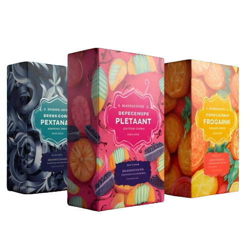
Product Packaging Design That Works: 4 Technical Principles That Actually Matter
Shoppers make decisions in seconds. Whether they’re breezing past a store shelf or scrolling on their phones, your packaging gets just a moment to answer three key questions: What is this? Why is it worth buying? Why should I trust it? This guide covers four essential design tips for product packaging that make a real difference. Keep your messaging clear. Make your specifications practical. By doing so, you can avoid costly mistakes, missed deadlines, and unnecessary rework.
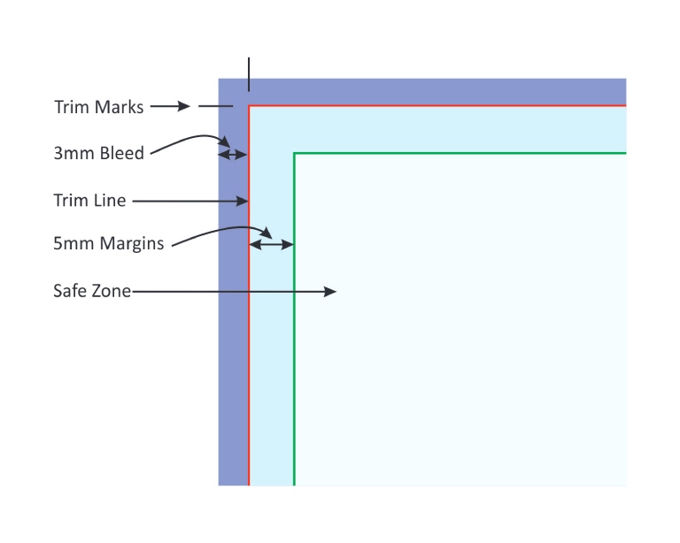
The Dieline Checklist for Print: Bleed, Safe Area, and Glue Areas
Printers cut thousands of sheets every hour, and small shifts in alignment are inevitable. That's why your design should always allow for these slight variations. Treat the dieline like an engineering blueprint; it determines whether edges look crisp, folds work as intended, and glue holds everything together securely.
- Bleed: Extend background color/graphics past the trim line by 3 mm (1/8 in) minimum for folding cartons and corrugated boxes; on flexible mylar packaging or rougher processes (some flexo), go 4-5 mm. It prevents hairline white edges after trimming.
- Safety (safe area): Keep logos, small text, and critical artwork 5 mm inside the trim on product boxes and 5-7 mm on stand-up pouches or where web stretch can happen.
- Scores & folds: Don’t place tiny text or hairline rules across a fold; move important details off the crease for better visibility.
- Glue flaps & windows: Keep glue areas free of varnish or laminate to ensure the adhesive bonds properly. On window boxes where a PET window is required, make sure to leave enough clearance around the fold to prevent buckling or distortion.
Print the dieline at 100% on office paper, fold it up, and check if any critical elements fall on a cut, crease, or glue. If you wouldn’t feel confident shipping that mockup, revise your file before moving forward. Once the structure works within real-world tolerances, turn your attention to color. Even the best layouts can look dull or muddy if the colors aren’t properly prepared for the printing process.
Color That Prints - Not Just Screen-Pretty
Vibrant colors on screen can fall flat during printing if your files don’t account for ink limits, paper type, and registration tolerances. Design with the production process in mind to ensure your brand colors remain consistent and eye-catching across various materials and print runs.
- Color mode & profiles: Create your artwork in CMYK, or use defined Pantone or spot colors where necessary. Always apply the printer’s recommendations to your files, and ensure your proofs are matched to that same profile for accurate color results.
- Rich black & overprints: Expect a slight shift between colors. Add 0.1-0.2 mm of trap (color overlapping) where two colors meet, especially in flexography. Avoid ultra-thin white keylines that depend on perfect registration. For large areas of solid black, use a rich black formula (such as C60 M40 Y40 K100) to achieve depth and uniformity. For small text and fine lines, stick to 100% K (black only) to prevent blurred edges caused by registration issues.
- PMS colors: If your brand depends on an exact color match, specify it as a Pantone color. It ensures consistent, accurate color reproduction across every print run.
- Images & screens: Ensure all images are placed at 300 dpi at their final size, avoid enlarging them during export, as this can reduce quality. For flexographic printing, steer clear of ultra-fine highlights; maintain a minimum dot of around 2-3%, depending on the specific plate and anilox roller used. It helps preserve detail and ensures reliable print results.
- Proofing: Always approve a proof before final production. The approved sample sets the standard your print run will match, so review it carefully to ensure color and finish accuracy.
Once your colors are set, the next challenge is physical durability. Product packaging that is prone to crushing, rattling, or incurring extra shipping costs can undermine your efforts. Thoughtful structural design addresses these issues, providing protection and stability where ink alone cannot.
Right Size, Right Structure - Strength, Shipping, Shelf Fit
Structure is a crucial part of design; it shapes shipping costs, product protection, and shelf presence. Even a few millimeters in your packaging can shift your freight classification or impact customer satisfaction and positive reviews. Thoughtful structural choices pay off in both logistics and brand perception.
- DIM weight: Couriers charge by whichever is higher: the package’s actual weight or its volumetric (dimensional) weight. Minimize empty space inside your packaging by reducing headspace by 5-8 mm where possible and optimizing inserts for product protection. Custom sizing can lead to significant savings.
- Flute & board:
- E-flute: crisp print, good for lighter goods.
- B/C-flute or double-wall: ideal for heavier items, better crush resistance.
- SBS 16–24 pt: For premium cartons, optimized board thickness and folding to prevent cracking.
- Inserts: Use die-cut board, molded pulp, or foam inserts to hold the product securely in place and prevent movement. A snug fit insert protects the product from damage and helps reduce returns due to shipping issues.
- Standability & facings: For retail displays, ensure your display boxes and packaging stand upright and present a clear, readable front. If your packaging is designed to hang, double-check that the euro hole (hanging hole) is positioned to avoid covering important graphics and that it complies with retailer specifications.
Conduct a “garage test” by dropping the package from waist height three times, each on a different edge, followed by a gentle shake and a top-load of 15-20 kg for one minute on small cartons. Address any weaknesses you find. Remember, even the most durable box can disappoint if it’s difficult to open or the labeling isn’t clear. Usability is key; it’s what transforms a delivered product into a satisfied customer.
Usability & Accessibility - Open, Read, Reseal Without Friction
If opening the package is difficult or confusing, and the text is hard to read, you can expect more returns. Ensure instructions and product details are clear, easy to follow, and visible in everyday lighting, not just under studio conditions. Making the experience comfortable and straightforward encourages customer satisfaction and repeat business.
- Open/close cues: Incorporate simple usability features, such as tear notches on pouches and thumb notches or clear prompts like “Peel here” on boxes. For products intended for multiple uses, resealable options like zippers, peel-and-reseal labels, and peel-off strips on corrugated mailer boxes significantly enhance customer satisfaction.
- Information order: Name → main benefit → variant/size → key instructions. Avoid placing important usage steps on flaps or areas that customers are unlikely to see. Make essential details easy to find and read at a glance.
- Finish choices: Use matte or satin finishes for areas with lengthy text to prevent glare and maintain readability. Reserve gloss or foil accents as highlights to draw attention to key elements, rather than covering large areas.
Hand the package to someone without any instructions. If they hesitate to open it or overlook an important message, reposition the information for better visibility.
Conclusion
Beautiful packaging that ignores these four technical areas will cost you time, money, and trust. Get the dieline right, control your color for the press, size, and structure for real-world shipping, and design for easy use and reading. Do that, and your pack won’t just look good in a mockup; it will print cleanly, scan reliably, ship cheaper, survive the journey, and feel great in a customer’s hand
Packaging Design & Printing Services
Packagingblue offers customized commercial printing solutions to meet your business needs. Our expert team delivers top-notch design and printing services that exceed expectations. Contact us today for a free consultation.